The Importance of Colour in Interior Design

Updated: Oct 5
Colour is one of the first things people notice when they enter a room, even if they do not consciously think about it.
A pale wall colour can make a smaller room feel more open. Warm beige or soft taupe can make a larger room feel more inviting. Deep green, navy, or charcoal can add depth and create a more defined look.
The overall effect comes from more than the wall colour. Flooring, cabinets, trim, doors, countertops, and lighting all contribute to the room's colour story.
For example, cool grey flooring with bright white walls and black hardware creates a very different atmosphere from honey-toned flooring with cream walls and warm bronze accents. Both combinations can be beautiful — they simply create different moods.
Here are a few common moods and the colour directions that support them:
Mood | Colours that often support it | Where they work well |
Calm and airy | Warm white, soft grey, greige, pale beige | Bedrooms, living rooms, open-concept spaces |
Cozy and welcoming | Cream, taupe, warm brown, clay, muted gold | Family rooms, dens, dining areas |
Clean and fresh | Soft white, light wood, gentle blue, pale green | Kitchens, bathrooms, laundry rooms |
Grounded and dramatic | Charcoal, deep green, navy, espresso, walnut | Accent walls, cabinets, doors, built-ins |
The goal is balance. If every surface is light, a room can sometimes feel washed out. If everything is dark, the space can feel heavy. A combination of light, medium, and deeper tones usually creates a more complete and comfortable interior.
Let Your Flooring Guide the Colour Palette
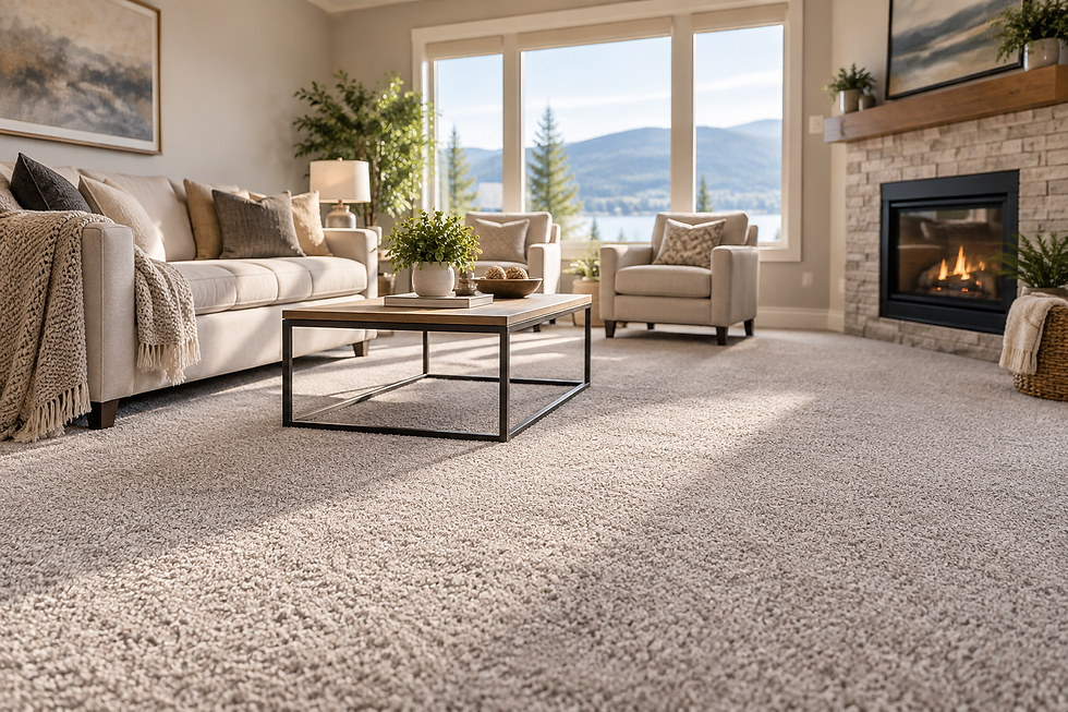
Flooring is one of the strongest colour decisions in a home. It covers a large visual area, connects rooms, and typically stays in place much longer than paint.
For this reason, wall colours, cabinets, trim, and doors should be chosen with the flooring in mind.
Wood and wood-look flooring can have different undertones. Some floors lean golden or yellow, while others have red, orange, grey, brown, or neutral undertones. These subtle tones can affect how nearby colours appear.
Golden or honey-toned flooring often works beautifully with warm whites, creamy neutrals, soft greens, and earthy colours. Cool blue-grey walls can sometimes make warm flooring appear more orange by comparison.
Grey flooring can create a clean, modern look with white, charcoal, or soft blue. However, combining several cool finishes can sometimes make a room feel cold. Warmer paint colours, natural wood accents, and textiles can help create more balance.
Dark flooring adds richness and depth but can absorb light. Lighter walls and trim can help keep the space feeling open.
Medium-toned flooring is often versatile because it can work with both warm and cool colour palettes.
The best flooring colour should connect with the rest of the home rather than compete with it.
If your flooring has strong grain or movement, quieter wall colours can help create balance. If the flooring is simple and understated, walls or cabinets can carry more colour.

Choose Wall Colours Around Your Fixed Finishes
Paint is generally easier to change than flooring, cabinets, countertops, tile, and trim. That makes wall colour flexible, but it also means it should support the finishes that are already in the room.
Before choosing a wall colour, consider:
Flooring colour and undertone
Cabinet colour or stain
Countertop pattern and base tone
Kitchen and bathroom tile
Trim and door colour
Fireplace stone, brick, or other permanent finishes
A paint colour that looks beautiful on its own may look completely different beside a particular floor or countertop. This is why paint samples are so important.
Whenever possible, test larger samples in the actual room and look at them throughout the day. Morning, afternoon, and evening light can all change how a colour appears.
Soft Neutrals Can Create Flow
Warm white, greige, pale taupe, and light beige remain popular because they can work across many rooms.
This is especially helpful in open-concept homes, where the kitchen, dining area, and living room are visible at the same time. A consistent neutral palette can create a smooth transition from one area to another while still allowing each space to have its own personality.
Deeper Colours Can Add Purpose
Deeper colours can give a room more identity.
A dining room may feel more intimate with a deep green or smoky blue. A bedroom can feel more settled with muted charcoal, olive, or warm brown. A powder room can be a great place to introduce more personality because it is usually smaller and separate from the main living areas.
The key is balance. In a room with limited natural light and dark flooring, very deep walls may make the space feel heavy unless the lighting, trim, and other finishes provide enough contrast.
Cabinets, Trim, and Doors Complete the Look
Cabinets, trim, and doors are an important part of the overall colour palette. They create structure and help define the finished appearance of a room.
White trim remains popular because it provides clean lines and works with many colour schemes. However, whites can have different undertones too. Some are cool and crisp, while others are warm and creamy.
For a cohesive look, wall colours should work comfortably with the existing trim and doors.
Cabinets Need to Work With the Room
Kitchen and bathroom cabinets often carry a lot of visual weight.
White cabinets can create a bright and timeless look, while colours such as sage, navy, mushroom, charcoal, or warm off-white can add more personality.
Wood cabinets bring their own natural colour and undertones into the space. Honey-toned wood, darker walnut, and reddish wood tones can each create a different starting point for the rest of the palette.
Whatever cabinet colour you choose, it should work together with the flooring, countertops, walls, hardware, and lighting.

Doors Can Add Contrast
Interior doors do not always have to be plain white. Soft black, warm grey, taupe, or deep brown can add depth and interest, particularly in hallways or rooms with simple wall colours.
For a subtle look, doors can match the trim. For more contrast, doors can be darker while the trim remains light.
Natural Light Changes Everything
Natural light can significantly change the appearance of colour.
The same paint can look bright and warm in one room and cool or muted in another.
North-facing rooms often receive softer, cooler light. Warm whites, creamy neutrals, and gentle earth tones can help create a more comfortable feeling.
South-facing rooms generally receive stronger, warmer light during the day. Colours may appear brighter and more intense in these spaces.
East-facing rooms tend to feel brighter in the morning and cooler later in the day, while west-facing rooms often become warmer and more golden in the afternoon and evening.
Artificial lighting also affects colour. Warm bulbs can make whites look creamier, while cooler bulbs can make greys, blues, and whites appear sharper.
This is why it is important to look at paint and finish samples under the actual lighting conditions of your home.
The colour that looks best at noon may not be the colour that feels best after sunset.
Create a Colour Palette That Flows Throughout Your Home
A cohesive interior does not mean every room needs to look identical. Instead, the colours should relate to one another.
A simple approach is to start with:
One main flooring tone
One trim and door direction
One or two main wall neutrals
One or two accent colours
Compatible hardware and metal finishes
From there, each room can have its own character.
For example, a living room might use warm greige walls with natural wood flooring, while a bedroom could use the same flooring with a deeper muted green. A bathroom could continue the neutral palette while introducing soft blue or warm white tile.
This creates variety while keeping the overall home connected.
Pay Attention to Undertones
Undertones are the subtle colours beneath the main colour. Beige can lean pink, yellow, green, or grey. White can lean blue, cream, or stone. Wood can have orange, red, brown, or ash undertones.
When undertones clash, a room can feel slightly off even when every individual colour looks attractive.
A simple way to test this is to place your flooring, paint, cabinet, and trim samples together. Look at them in the actual room and under different lighting conditions.
If one colour suddenly looks too yellow, pink, blue, or grey beside the others, it may not be the right choice for that space.
Repeat Colours for a More Intentional Look
Repeating colours throughout a room helps the design feel intentional.
A warm wood floor can be connected to a wood mirror, dining table, or natural accessories. A deep cabinet colour can appear again in artwork, a rug, or accent pillows. Black doors can coordinate with black hardware or light fixtures.
The colours do not have to match exactly. They simply need to feel connected.

Choosing Colours with Confidence
Colour decisions become easier when they follow the permanent features of the room. Start with the surfaces that are hardest to change, then work toward the details.
A practical order looks like this:
Choose or identify the flooring.
Confirm cabinet, counter, or built-in colours.
Choose trim and door colours.
Test wall colours in the actual room.
Bring in accents through furniture, rugs, lighting, and decor.
Colour decisions become easier when you start with the permanent features of the room and work toward the details.
This approach can help prevent the common mistake of choosing a wall colour first and then trying to make every other finish work around it.
The right interior colours can change how a home feels every day. They can make rooms feel brighter, warmer, calmer, or more polished — while helping flooring, cabinets, trim, and doors feel like part of one cohesive design.
Planning an interior update?
At Wuerz Installation Inc., we bring flooring installation and interior finishing together to help create spaces where the materials, colours, and details work beautifully as a whole.


Comments